Giovanni Michelucci
Identity design for an architect and design studio run by Giovanni Michelucci.
Giovanni Michelucci is a multi-award winning, internationally recognised architecture and design studio.
The design challenge was to create an identity that portrayed a high level of professionalism that would attract a certain demographic.
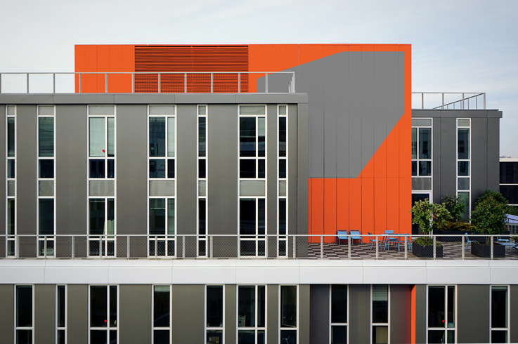
Michelucci wanted his brand identity to play with the idea of lights and shadows, staying away from generic stereotype logos of building shapes along with incorporating best use of sleek typography.
Using this information, my aim was to bring in a clean, minimalist, contemporary style to the design studio.
The logomark was designed with this in mind, creating a simplistic take on the phrase ‘shining the light’. The square represents a door/window with light shining through. It reflected Michelucci’s style of design.
Colour palette was kept simple. Using dark blues and greys with an earthy orange to highlight different areas of design brought together the overall identity.
"Shine the light"

Logo

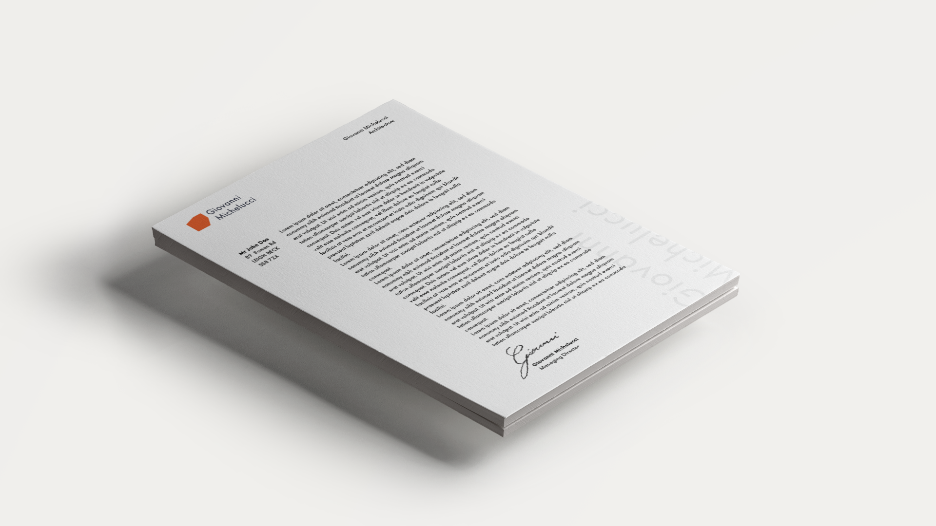
Letterhead

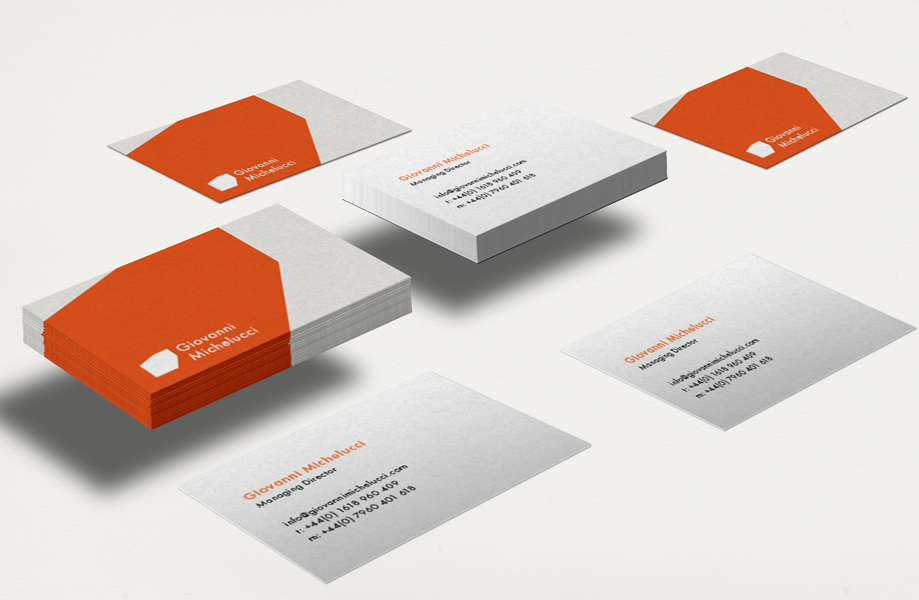
Business Cards

Client
Giovanni Michelucci
Discipline
Identity Design
Stationery
Web Design

